longer than usual
 (see also: this post)
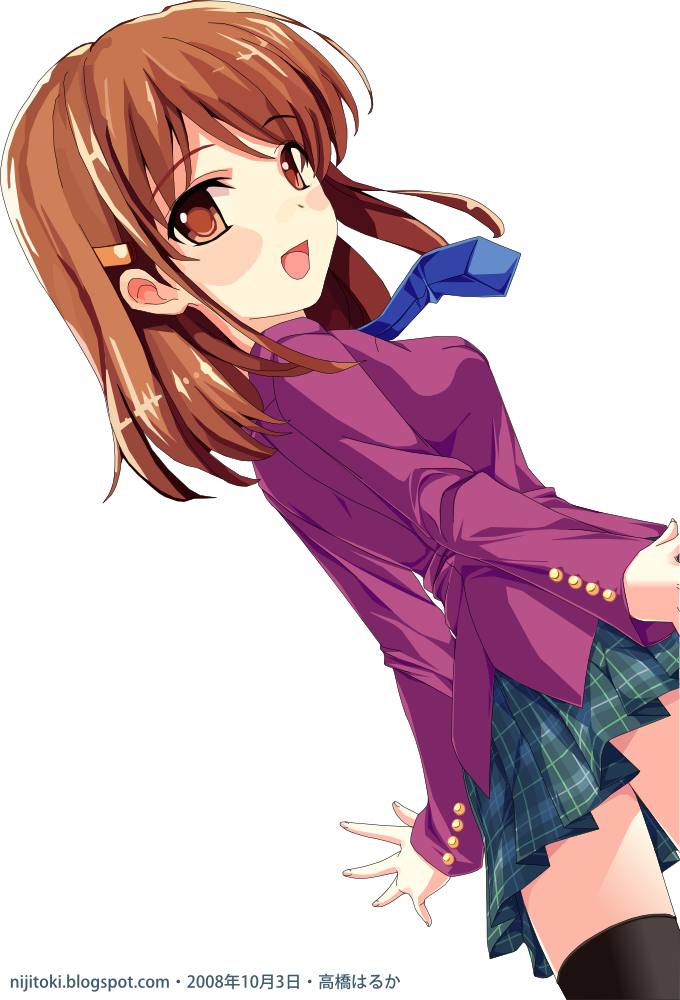
Okay, I have finally manage to finish this one which seems to be taking forever to complete. I started doing this since 29 September 2008, the day after the previous one.
I would normally complete in less than 24 hours, but seems to take longer than expected. This is because there had a bunch of new anime to watch, stuff to clean up, fix and prepare around the house, a story that took me about 3 hours to do, and my parents dragging me to places I don't want to go to like visiting (almost all of) my relatives in a day or a place full of middle-aged and older people.
On top of that, there are a lot of small details that I had to pay close attention to, especially the pleated skirt and shadows. (Shadows on the pleated skirt are even harder to do.)
However the overall file size of the vector (before converting to PNG) is only about 400 Kilobytes, only about double of the average vector.
As you have noticed, I have also changed the font I have *cough* found somewhere. The previous one was okay, but this one is better. I have no plans to change the fonts of the earlier ones though. It's too troublesome looking at the current vector count.
I checked the photo-based vector that Yoko has done: even though the PNG image file says it's around 250 Kilobytes, the original vector of it is about 2.08 Megabytes. An amount that is several times more than mine.
Not convinced that I did it? Here are some samples from it:

A closer look of the right-hand side. If you click on it, you would be able to see more detail of that area than the top image. A portion alone is hard to do, imagine the entire thing!
Since I had just completed it after a very long time, I think I would make the lines smoother instead of multiple straight lines you see now at a later time, except for the buttons and the eyes, which are already done.
4 October 2008 1:57AM edit:
I had somewhat manage to fix the problem of a vector I did 3 weeks ago. It's nothing major, but it certainly looks a lot beter that the previous version. Changes include replacing the mouth with the one I did earlier, re-alignment of the hair of the girl on the right, and thinning of the outlines by half. The horizontal empty spaces has also been cropped out and the signature has been change to reflect the newer version.
Old:

New:

I didn't know that just adjusting these would make a lot of difference. I thought the fault lies in the eyes.

Comments