401st post: New layout theme
(originally posted on the updates blog a while ago)
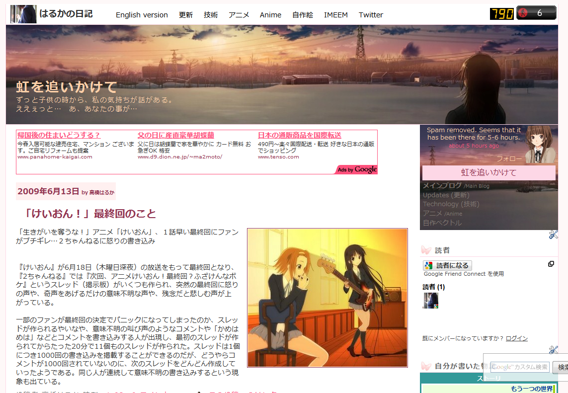
I have replaced the Japanese version of my main blog with this new layout. Readers who had been to my layout-testing blog recently (before it got marked as a spam blog) or had been to my main blog (in English) around Mid-2008 or earlier with "Hatena :: Diary" at the top left. (Hatena is where the layout came from and had to modify to be usable as Blogger Classic code.) This was because the old one started to looked awful and it's kind of ironic that both the English and Japanese started off with the same layout theme at the time I first implemented it (forgot when that was though) and that the former blog started to drift apart. The same layout code was also gradually applied to all my other blogs, but with modifications to make them look different.
With this change, I have also changed the side navigation menu to the new style since the old one didn't really match well and can't even see the first post without scrolling down a bit. It's been cleaned up with fewer images and having one of the sidebars removed. The space freed up really helped me a lot on making the blog look better.
I looked back at it earlier this week and decide to use it, but I want it to work with Blogger XML instead of the Classic one to modify it easily. I don't need to get a whole new code: I just need to modify the existing one. If you ask me to do the same thing just a year ago, I probably would not know how to do it. Editing the size and additional words to the date involves further digging into the code accessible with the "Expand Widgets Templates" option checked. What annoyed me is that using Blogger's "Font and Color" settings seemed to only work for the colours and not the typeface of the text despite the code being there and had to modify the code manually.
Speaking of codes, I obtained the colour codes via Inkscape (the program I used to do my vectors) by pressing the button to take a screenshot (in Linux, a prompt soon follows asking where to save the screenshot you just did) and pasting it into the the program. This can get tricky: the bottom part (percentage varies) may become corrupted and appears to be random. Do note that the screenshot might be saved as "pastedpic_***.png" at the folder of where you last saved a file with this program (If unsure, check the properties.). To overcome this, paste the image in Paint first and save it as a PNG (or BMP) file and import it. Since the area of the colour you want to choose can be quite small, especially text, you might want to use the browser's zoom feature to the area in question before taking the screenshot.
The search box at the bottom right is rather unique too. Since it was copied over from the old code, which itself was from Hatena, I don't really know how it appears to be transparent, is fixed on top, and does not move while scrolling the page. I only know how to change the content or position it.
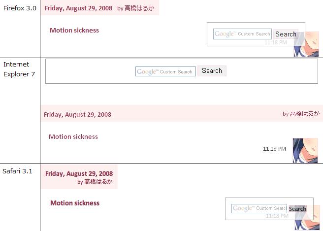
This comparison image was from last year, describing how different the layout of my latest post (back then) was rendered in various browsers with visible differences. Safari is the one that follows the web standards the most, and Internet Explorer (version 6 and earlier especially) the least.
I didn't make a screenshot before to the current layout, but I did manage to find one of the same layout from quite some time ago:
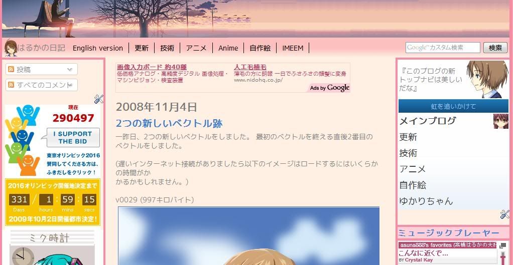
(It doesn't really differ much, doesn't it?)
And here's the one from before I used that layout:
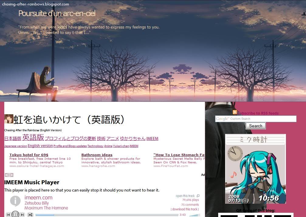
(Looks nice, but the header image is too large. Despite the large screenshot, the first post can't be seen here. That thing between the header and the ad is an early version of the current side navigation menu. Can't believe how large the text was.)
Will I apply the new layout to the English version too? Well, I haven't decided on that yet, but I did apply the same, consistent, layout for the Anime (Japanese & English) and drawings blogs that previously had bizarre layouts and inconsistency that, looking back, is horrible.

I have replaced the Japanese version of my main blog with this new layout. Readers who had been to my layout-testing blog recently (before it got marked as a spam blog) or had been to my main blog (in English) around Mid-2008 or earlier with "Hatena :: Diary" at the top left. (Hatena is where the layout came from and had to modify to be usable as Blogger Classic code.) This was because the old one started to looked awful and it's kind of ironic that both the English and Japanese started off with the same layout theme at the time I first implemented it (forgot when that was though) and that the former blog started to drift apart. The same layout code was also gradually applied to all my other blogs, but with modifications to make them look different.
With this change, I have also changed the side navigation menu to the new style since the old one didn't really match well and can't even see the first post without scrolling down a bit. It's been cleaned up with fewer images and having one of the sidebars removed. The space freed up really helped me a lot on making the blog look better.
I looked back at it earlier this week and decide to use it, but I want it to work with Blogger XML instead of the Classic one to modify it easily. I don't need to get a whole new code: I just need to modify the existing one. If you ask me to do the same thing just a year ago, I probably would not know how to do it. Editing the size and additional words to the date involves further digging into the code accessible with the "Expand Widgets Templates" option checked. What annoyed me is that using Blogger's "Font and Color" settings seemed to only work for the colours and not the typeface of the text despite the code being there and had to modify the code manually.
Speaking of codes, I obtained the colour codes via Inkscape (the program I used to do my vectors) by pressing the button to take a screenshot (in Linux, a prompt soon follows asking where to save the screenshot you just did) and pasting it into the the program. This can get tricky: the bottom part (percentage varies) may become corrupted and appears to be random. Do note that the screenshot might be saved as "pastedpic_***.png" at the folder of where you last saved a file with this program (If unsure, check the properties.). To overcome this, paste the image in Paint first and save it as a PNG (or BMP) file and import it. Since the area of the colour you want to choose can be quite small, especially text, you might want to use the browser's zoom feature to the area in question before taking the screenshot.
The search box at the bottom right is rather unique too. Since it was copied over from the old code, which itself was from Hatena, I don't really know how it appears to be transparent, is fixed on top, and does not move while scrolling the page. I only know how to change the content or position it.

This comparison image was from last year, describing how different the layout of my latest post (back then) was rendered in various browsers with visible differences. Safari is the one that follows the web standards the most, and Internet Explorer (version 6 and earlier especially) the least.
I didn't make a screenshot before to the current layout, but I did manage to find one of the same layout from quite some time ago:

(It doesn't really differ much, doesn't it?)
And here's the one from before I used that layout:

(Looks nice, but the header image is too large. Despite the large screenshot, the first post can't be seen here. That thing between the header and the ad is an early version of the current side navigation menu. Can't believe how large the text was.)
Will I apply the new layout to the English version too? Well, I haven't decided on that yet, but I did apply the same, consistent, layout for the Anime (Japanese & English) and drawings blogs that previously had bizarre layouts and inconsistency that, looking back, is horrible.

Comments